Image 1A c. 2500 B.C.
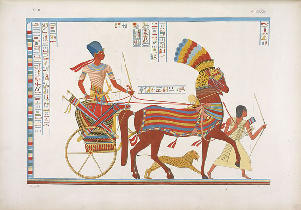
Image 1A c. 2500 B.C.

Image 1B c. 1000 A.D.

Image 1C c. 1489 A.D.
In their quest for realistic representation of the external world, painters have been faced with a number of insurmountable problems. Several are associated with the fact that you have two eyes. Two eyes looking at a three-dimensional world can see more of that world than one eye. Thus, as Euclid pointed out well over 2,000 years ago, if you have a small sphere in front of you, one eye can see one hemisphere but two eyes can see a bit more as each eye sees a slightly different hemisphere. Moreover, binocular disparity and its associated depth cue, stereopsis, cannot be painted onto a flat canvas. Similarly, head movements reveal even more of the scene and lead to their own depth cue, motion parallax, but that cue can’t be portrayed in a flat canvas either.
Artists have long been aware of these problems. Indeed, Leonardo da Vinci sounds quite annoyed when he writes about them. He wanted to duplicate nature and seems to have considered it quite unfair of Nature to throw such roadblocks in his way. Still, artists throughout the ages have done the best they could. Click on Image 1 to step through the annals of art history and see the occlusion cue being used by the Egyptians (Image 1A), the addition of relative height (but not relative size) in the early Middle Ages (Image 1B), and full-fledged use of nearly all the pictorial depth cues in a painting from the late 1400s (Image 1C).
Part of the realism in Image 1C comes from its use of linear perspective, which is often said to have been “discovered” during the Italian Renaissance. This statement is fair enough as long as we understand it to mean that Renaissance artists developed an explicit understanding of what every neurologically intact human (and monkey, cat, etc.) had known implicitly forever. What was developed in the Renaissance was the technical skill to exploit linear perspective in order to make more compelling two-dimensional images of three-dimensional space.
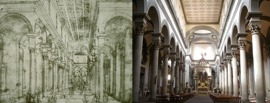
Image 2 The interior of Brunelleschi's Church of Santo Spirito: Brunelleschi's drawing (left) and a photo of the church (right).
Credit for the discovery is often given to the Florentine architect, Filippo Brunelleschi. An understanding of the rules of the vanishing point was a useful tool for an architect. It allowed Brunelleschi to draw the picture of the Church of Santo Spirito shown on the left of Image 2. Comparison with the photograph on the right makes it clear that the drawing is quite faithful. What is more striking is that it was drawn before the church was built. Based on the rules of perspective, Brunelleschi was able to show potential backers what the church would look like before it existed.
Brunelleschi may have gotten the science of perspective started but it was Leon Battista Alberti who spread the word when he literally wrote the book on the topic in 1435. From that point on, you didn’t have to study with Brunelleschi or one of his students. You could just read the book. With this advance, knowledge of the rules of perspective spread widely across Europe. There were tricks of the trade. For example, Leonardo da Vinci took up one of Alberti’s suggestions and created what is still known as Leonardo’s window. In its simplest form, this would be a piece of glass held between the artist and the subject. If the artist traced what he saw on the glass, he would get a faithful two-dimensional projection of the three-dimensional scene.
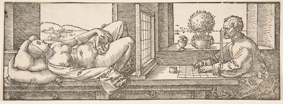
Image 3 Albrecht Dürer’s version of Leonardo's window.
Image 3 shows a slightly more elaborate version in a drawing by Albrecht Dürer (1471–1528). Here, the artist looks at the subject through a grid and copies the contents of each square of the grid onto his paper. Note the importance of keeping the eye in exactly one spot. You only get a faithful two-dimensional projection if you maintain a constant viewpoint. Moreover, the product is only a truly faithful image of the world if it is viewed from the same viewpoint that it was drawn from. This is a powerful illustration of just how unconcerned your visual system is when it comes to accurate reconstructions of the Euclidean world. A flat picture looks quite good as long as you do not view it from a completely extreme position. If this were not the case, there would be only one good seat in the movie theater (and that would change from shot to shot, depending on the camera’s position relative to the scene).

Image 4 Seventeen thousand years ago, artists knew that they could create two-dimensional representations of the three-dimensional world.
Patrick Cavanagh takes this argument one step further. He holds that art is interesting to vision scientists not because of how well artists mimic the physical world but because of how badly they can do so and still get away with it. A few lines on a cave wall 17,000 years ago (Image 4) can still give us the impression of a three-dimensional buffalo even though there are no lines around real objects in the real world.
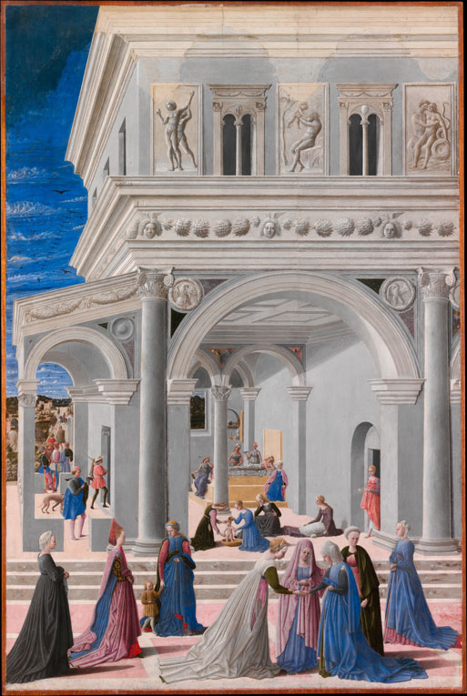
Image 5 Fra Carnevale, Umbria, 1456–1484, The Birth of the Virgin. 1467. (Metropolitan Museum of Art)
Shadows provide another useful illustration of the liberty artists are free to take while still convincingly fooling our visual systems. If you look at the 1467 painting by the Italian Fra Carnevale, shown in Image 5, it looks like a rather convincing representation of a plaza and arcade. But where is the light source? It could be that the sun is behind your right shoulder. That works for the lighting of the covered arcade, but then look at the shadows of the ladies at the front. Well, maybe the light is coming from low on the horizon off-stage to the left. No, that won’t work either. That would leave the arcade in shadow. The fact is that those shadows, taken together, are physically impossible. The psychophysical fact is that you don’t seem to care—at least, not until your attention is drawn to the matter.
Art history, from the vantage point of the study of visual perception, shows us that two-dimensional representations of the three-dimensional world are more convincing when the artist makes use of cues like occlusion, shadows, and linear perspective. However, the same works of art that show us that the artist who has mastered one or the other of the rules of representation may also show us that we use these cues locally. If the local cues make sense, the spectator will forgive global inconsistencies.
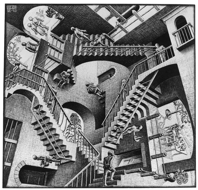
Image 6 Escher’s Relativity.
M.C. Escher’s specific talent lies in his clever exploitation of our blindness to global inconsistency. Look at his picture Relativity in Image 6. Any individual staircase in the image has depth relations that seem reasonable enough. On a staircase we see examples of depth cues like occlusion, texture gradients, shading, relative height, and relative size. However, while each individual staircase has a consistent story to tell in terms of its depth relations, the overall configuration of staircases is a dizzying mishmash of multiple perspectives. The bottom left staircase has a person walking down the underside of the staircase and another person walking up the top side. The staircase is an ambiguous figure (like the Schröder staircase in Activity 4.3) and the depth assignment of its’ parts switches, depending on which person you concentrate on. Furthermore, the entire collection of staircases do not tell a consistent story. What is the viewpoint of the observer in this picture? Which way is the direction of gravity? There are different answers for different parts of the image, which is what makes it so unsettling. Escher was an excellent draftsman and, no doubt, could have drawn a consistent picture, by the rules. Instead, he drew an inconsistent one by the same rules. Multiple points of view, all perfectly reasonable on their own, add up to an impossible image in which frames of reference collide and gravity is warped into several directions. Space seems to have twisted as we ascend the various staircases in Escher’s Relativity.