Monocular Depth Cues








Introduction
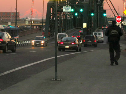
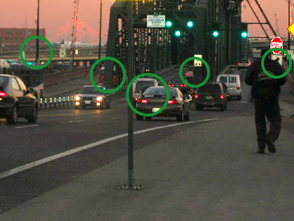
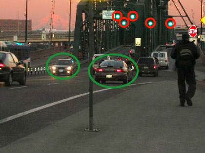
When you look at the photograph at left (of the Hawthorne Bridge crossing the Willamette River in Portland, Oregon), you get a compelling sense of depth—a sense that the various objects in the picture are at different distances from you—despite the fact that you’re really just looking at an array of light specks on your computer monitor, all of which are exactly the same distance from your eyes.
We infer object distances in photos using pictorial depth cues. Like the Gestalt principles we learned about in Chapter 4, no single depth cue is always available or always reliable, but by combining multiple pictorial cues, we are usually able to parse depth relations pretty well. We’ll cover seven pictorial cues in this activity: occlusion, relative size, familiar size, relative height, texture gradients, linear perspective, and aerial perspective.
The pictorial depth cues are a subset of our collection of monocular depth cues: cues that we need only one eye to use. The other two monocular cues we’ll cover in this activity are motion parallax and accommodation/convergence.
The other major depth cue, stereopsis, is binocular (you need both eyes to use it). Binocular vision and stereopsis will be the subject of the other three activities in this chapter.
Instructions
Click on the image links within the text of each page to see all images. The first time you do this activity, you should probably go through the parts in order from top to bottom.
Occlusion
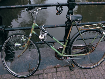
Occlusion is probably the most pervasive and most reliable of all the depth cues. It is also perhaps the simplest: If part of object A is covering part of object B, A is almost certainly closer to you than B. In Image 1, we perceive the bicycle to be in front of the railing because the bicycle’s parts cover the railing’s metal tubes.
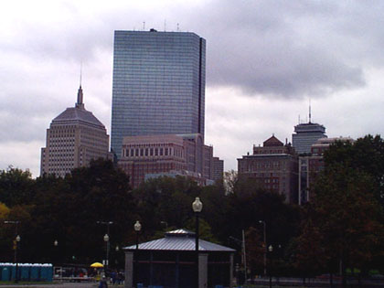
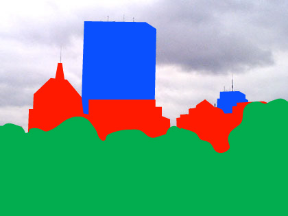
Image 2 shows another example in a more complex scene, a cityscape from Boston, Massachusetts. Here we perceive two clusters of tall buildings in the distance, one on the left and one on the right. In each cluster, one building is clearly perceived to be behind the rest because of occlusion: The John Hancock building on the left and the Prudential building on the right. Image 3 highlights the occlusion relations, and makes it clear that we also perceive the trees as being closer to us than the skyscrapers because they occlude the buildings.
Image 4 shows the Portland street scene again. Can you identify the places in the scene where occlusion allows us to disambiguate the depth relations? Image 5 highlights some of them.
Relative Size and Familiar Size
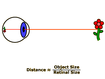
Remember the distance-to-object size to retinal-size relationship discussed back in the Chapter 3 activity on Visual Angle? We learned that visual angle is proportional to object size divided by distance from the observer. Thus, after doing a little reshuffling of the formula, we can determine that the distance from an object to our eyeball is proportional to the object’s size divided by its retinal size (Image 1).
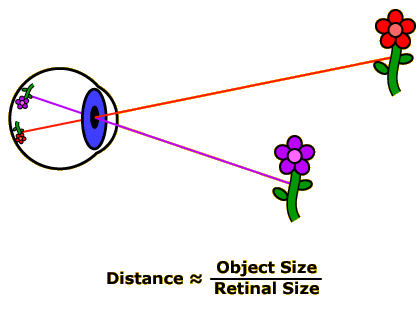
One consequence of this relationship is that the farther away an object is, the smaller it appears on the retina. Furthermore, if there are two of the same type of object present in the scene you’re looking at, the object whose retinal image size is smallest must be farthest away (and vice-versa: the object with the largest retinal image must be closest). Thus, in Image 2, the disembodied eyeball knows that the red flower is farther away than the purple flower because the red flower projects a smaller retinal image.
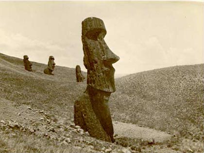
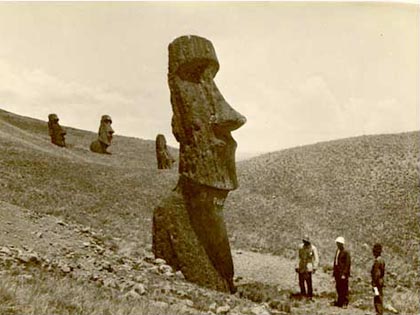
This monocular depth cue, called relative size, is quite effective because it turns out that in many real-world visual scenes, we see multiple objects that can be assumed to be about the same size. For example, in Image 3, one of the ways we know that the statue in the center of the photo is closer than the three statues on the left because the central statue’s retinal image is much larger.
As its name implies, the relative size cue tells us how far away different objects are relative to each other, but it can’t, on its own, tell us exactly how far away any of the objects are. However, if we know how big an object really is, our brains can solve the distance-equals-object-size-divided-by-relative-size relationship to determine absolute distances. In this case we are using the familiar size depth cue.
Thus, adding people to the statues in Image 4 improves the sense of depth compared to Image 3 because now you can use your knowledge about how tall people are to mentally calculate how far away they are. And since the people are standing next to the central statue, you can use them to judge the exact height of this statue (this is an alternative use of the relative height cue).
Returning to our Portland street scene again (Image 5), can you identify some sets of objects whose relative or absolute distances can be inferred from the size cues? Image 6 highlights two such sets of objects: The cars circled in green must be at different distances since their retinal sizes are different, whereas the traffic lights must all be at about the same distance since their retinal sizes are all identical.
Relative Height
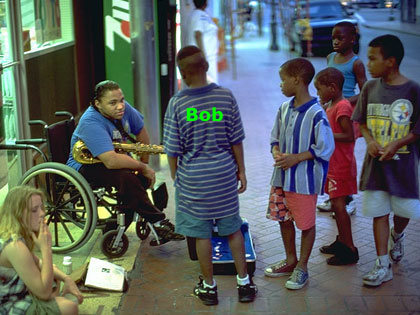
In Image 1, how far away is the boy in the center of the photo (call him Bob) relative to the other boys? Bob is not occluding any of the boys, and since we can’t say for sure how old any of them are, the size cues don’t help us either. Nevertheless, it should be quite clear that Bob is the closest of the boys.
We know this because of another depth cue, relative height. Physics tells us (or, at least, our brain’s implicit knowledge of physics tells us) that for objects standing on the ground, the higher an object is in the retinal image, the farther away it is.
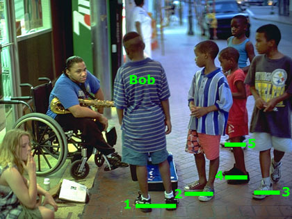
Image 2 makes the relative heights of the boys explicit: Bob (“1”) is closest, followed by the boys whose shoes are labeled “2” and “3,” then “4,” and finally “5.”
In Image 3, you should see that relative height alone is enough to provide a fairly powerful sense of one object being closer to you than another. At first, the red cube should appear farther away than the blue cube. Click and drag the red cube to move it around the yellow frame, and you should easily be able to make the red cube appear to be closer. Note that the shadows are crucial to getting a sense of depth in this image; without them, you might perceive the cubes as floating in midair, and the brain (appropriately) does not apply the relative height cue when objects aren’t rooted to the ground.
Image 4 shows our Portland street scene again. Can you identify the objects whose relative heights allow us to order them in depth? Image 5 highlights some of these objects.
Texture Gradients and Linear Perspective
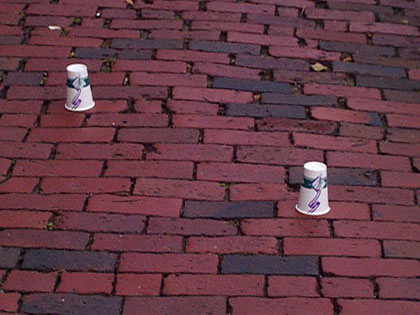
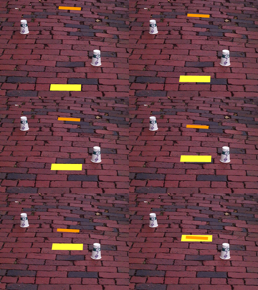
Our next two depth cues are really just special (but common and effective) combinations of relative size and relative height. In Image 1, it is readily apparent that the cup on the right is closer than the cup on the left. In part, this is due to the relative sizes and heights of the cups themselves. But the strong sense of depth in this picture is conveyed even more by the other objects in the image—the bricks.
For the most part, our brains consciously ignores the bricks because they are part of the background of the scene, and we’re usually more interested in objects in the foreground. Unconsciously, though, our brains notice that some bricks are considerably smaller and higher in the visual field than others (Image 2). Therefore, the bricks form a texture gradient. The distance to any object sitting on the texture can be accurately judged by comparing it to the part of the texture (i.e., the bricks) the object happens to be sitting on.
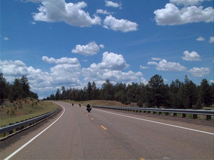
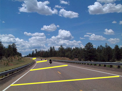
In Image 3, depth is conveyed by a similar cue, linear perspective. If we assume that the two sides of the road are parallel to each other, we know that the actual three-dimensional distance across the road is the same everywhere in the image. Therefore, the fact that the retinal distance across the road shrinks as the road goes on (Image 4) tells us that the road must be winding away from us into the distance. By extension, we can judge the relative distances of the motorcycles driving on the road.
You will never find texture gradients or linear perspective in a scene without also encountering the relative size and relative height cues, since, as we saw above, relative size and relative height effectively define texture gradients and linear perspective. However, when a scene includes a texture gradient and/or linear perspective, the sense of depth increases dramatically. For example, Image 5 shows our two cubes from the Relative Height part of this activity, with some background elements that provide a texture gradient and linear perspective. In this image, you should get a much more powerful sense that the cubes are at different distances.
There are two more interesting things to note in this image. First, you may perceive the red cube to be larger than the blue one. Click and drag the red cube so that it is next to the blue one, though, and you can confirm that the size of the two cubes is the same. When the cubes were in their original position, you perceived the red one to be farther away than the blue one, so your brain solved the distance–object size–relative size equation, calculated the actual object size of the red cube and determined that it must be bigger than the blue cube. The retinal sizes of the two cubes are equal, but the red cube’s distance is greater; therefore, the red cube’s object size must also be greater.
Second, if you start with the red cube back in its original position and drag it off to the right side of the window, you will probably perceive it as floating in midair right above the blue cube. Here, in the absence of a texture gradient cue, your brain sees that the retinal sizes of the two cubes are the same, assumes that the actual object sizes are the same, and therefore concludes that the distance to the two objects must be the same. This would mean that the red cube floating in the air must be at the same distance as the blue cube, which is a reasonable interpretation since there isn’t a shadow cue to indicate that the red cube is anchored to the wall.
Aerial Perspective
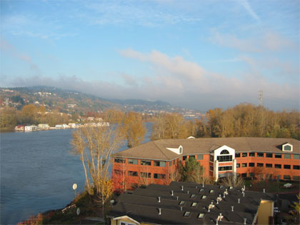
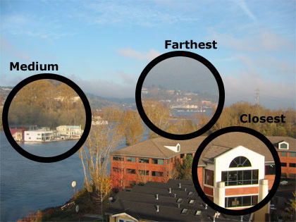
The atmosphere is mostly empty, but every molecule in the air scatters a little bit of sunlight, and over a long distance this scattering adds up to make distant objects appear hazier and less distinct than closer objects. This provides our last pictorial depth cue: aerial perspective, illustrated in Image 1. Look closely and you will see that the buildings in the lower-right portion of the photo are sharpest, the buildings across the river on the left are fainter, and the buildings above the trees in the center-right of the photo are hazier still (Image 2 shows close-ups of these three areas). Thus the distances of the three sets of buildings must be ordered accordingly (closest, medium distance, farthest).
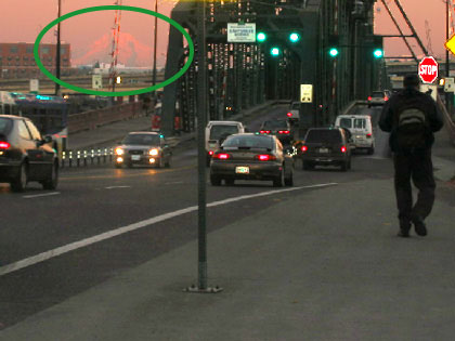
Image 3 shows our Portland street scene one more time. The object whose distance is determinable via aerial perspective should be obvious here: Mt. Hood (Image 4), which is located some 60 miles to the east of the point where this picture was taken.
Motion Parallax
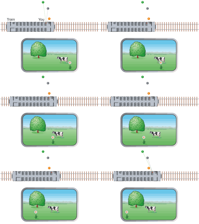
The last two depth cues we will discuss in this activity are not available in static pictures. We will illustrate the first of these monocular-but-non-pictorial cues with the situation diagrammed in Image 1. You are on a train (top) traveling through the countryside, looking out the window (bottom) at a flower, a cow, and a tree. A pictorial depth cue (which one?) already tells us that the flower is closest, the cow is in the middle, and the tree is farthest away. But when we set the train in motion (Image 2), the motion parallax depth cue kicks into effect, and the depth relations jump out in a much more compelling way.
Motion parallax is based on the idea that objects that are closer to you move more quickly across your field of view than objects that are farther away. When your head moves, every object in the scene you’re looking at shifts position on your retina. The fact that objects that are closer to you shift position more than objects that are farther away is just a consequence of projective geometry. And once again, we find that your brain knows more about geometry than you probably realized, because it instantly compares the relative magnitudes of these position shifts to order the objects in depth.
You can also see motion parallax in action with the following demonstration: Hold your right index finger up about a foot in front of your face, then hold your left index finger up at arm’s length. Now close one eye and move your head back and forth from right to left (you have to actually move your head, not just shift your gaze). You will see your right finger move much farther across your field of vision than your left finger, and the depth relation between the two fingers will pop right out.
Accommodation/Convergence
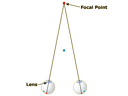
Our final monocular depth cue, which, like motion parallax, is only available in the real world (not in pictures) is a byproduct of the process of focusing our eyes. When you are focused on a distant point (Image 1), your eyes are pointed at a certain angle toward each other and your lens is relatively thin.
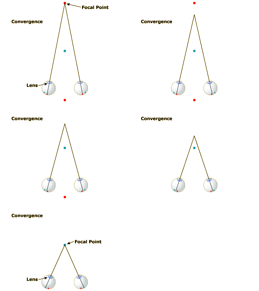
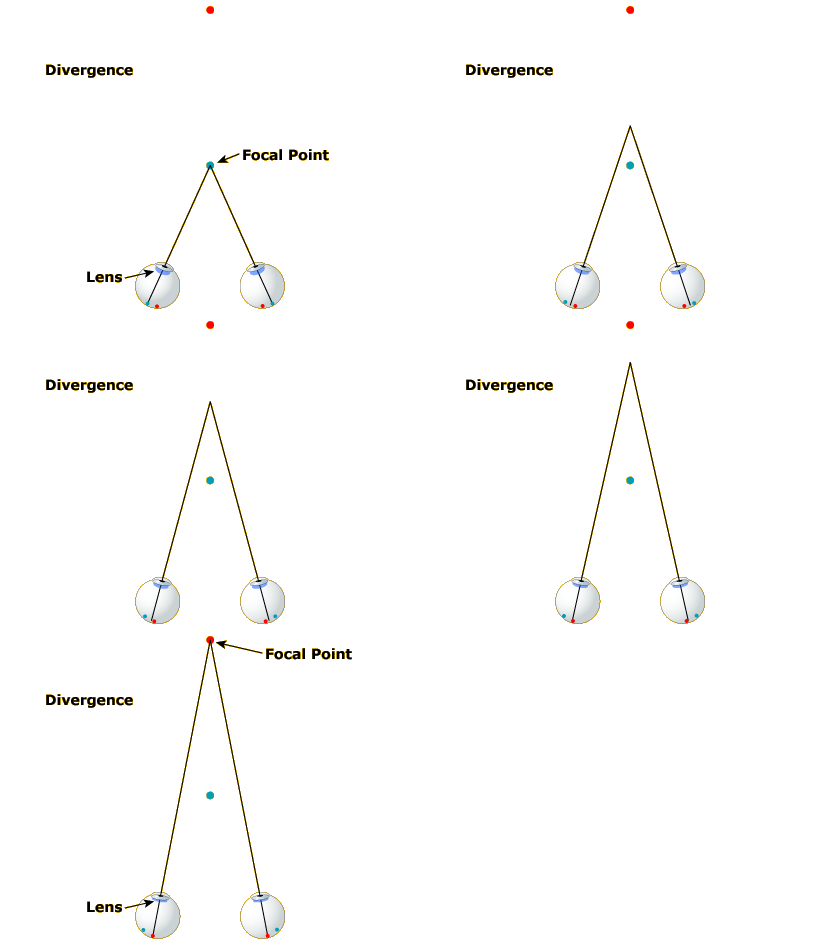
As you shift your gaze to a nearer spot (Image 2), your eyes turn inward and your lens gets fatter. The eye-turning is called convergence and the lens fattening is called accommodation. If you reshift your gaze to the more distant spot (Image 3), your eyes diverge and your lens gets thinner again.
Thus, assuming your brain has access to the state of the muscles controlling your lens shape and gaze direction, the extent to which your eyes are converged and your lens is accommodated should provide cues to the distance of the object you are focused on. If your lens is fat, you must be looking at something near; if your lens is thin, the object must be farther away.
Note that accommodation and convergence almost always occur in concert. This is why they are listed as a single depth cue.